
Project Brief
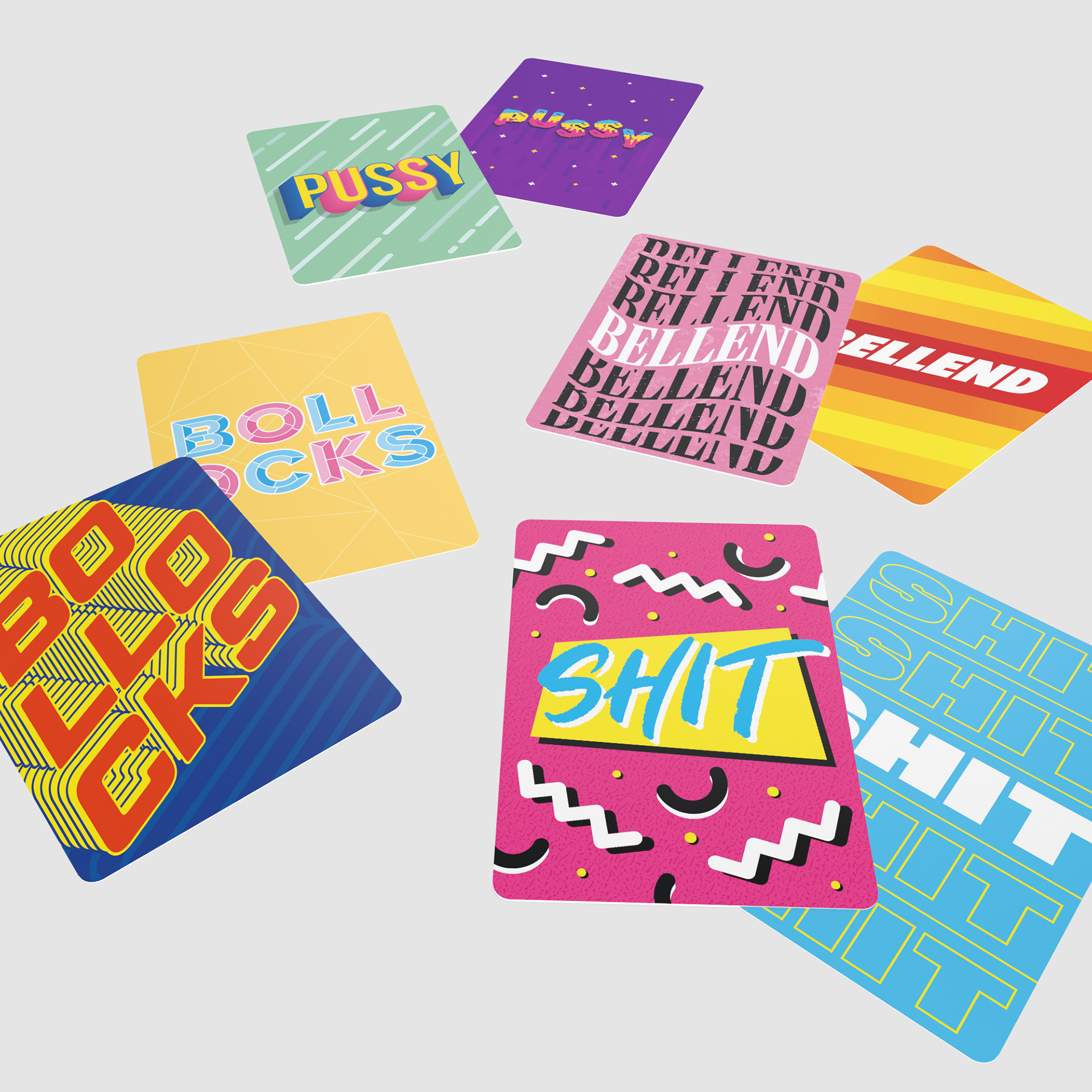
The client asked me to develop a deck of typographic cards using designs based around curse words in various styles. Alongside this, I was to also develop the outer packaging which would hold the cards and be the first impression made upon a potential customer.
Who Is It For?
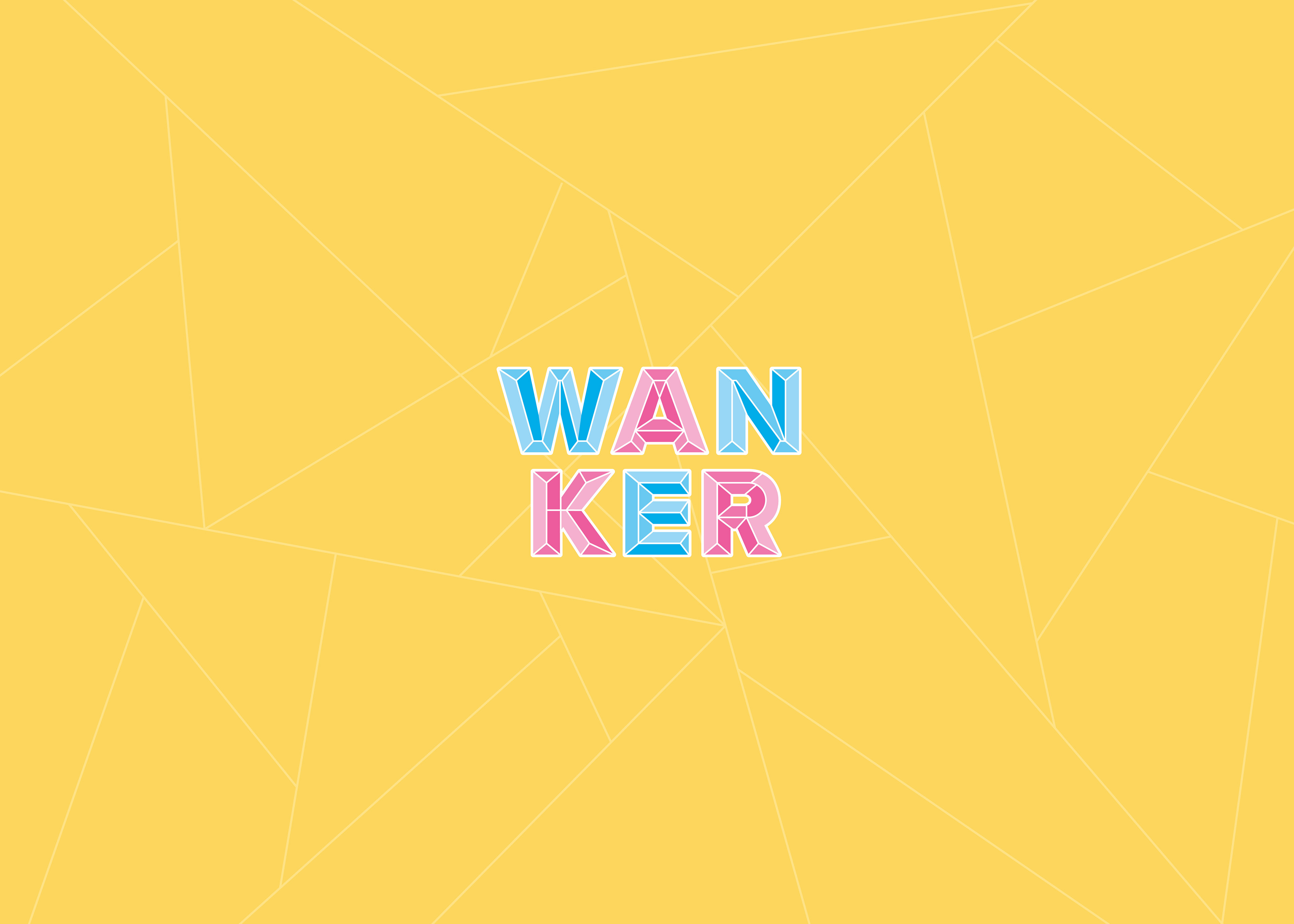
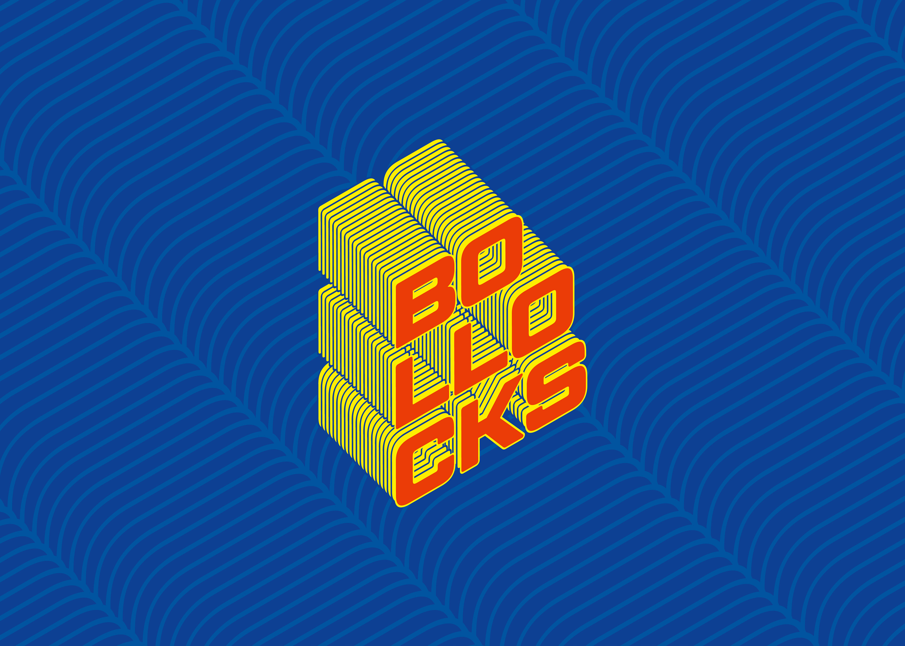
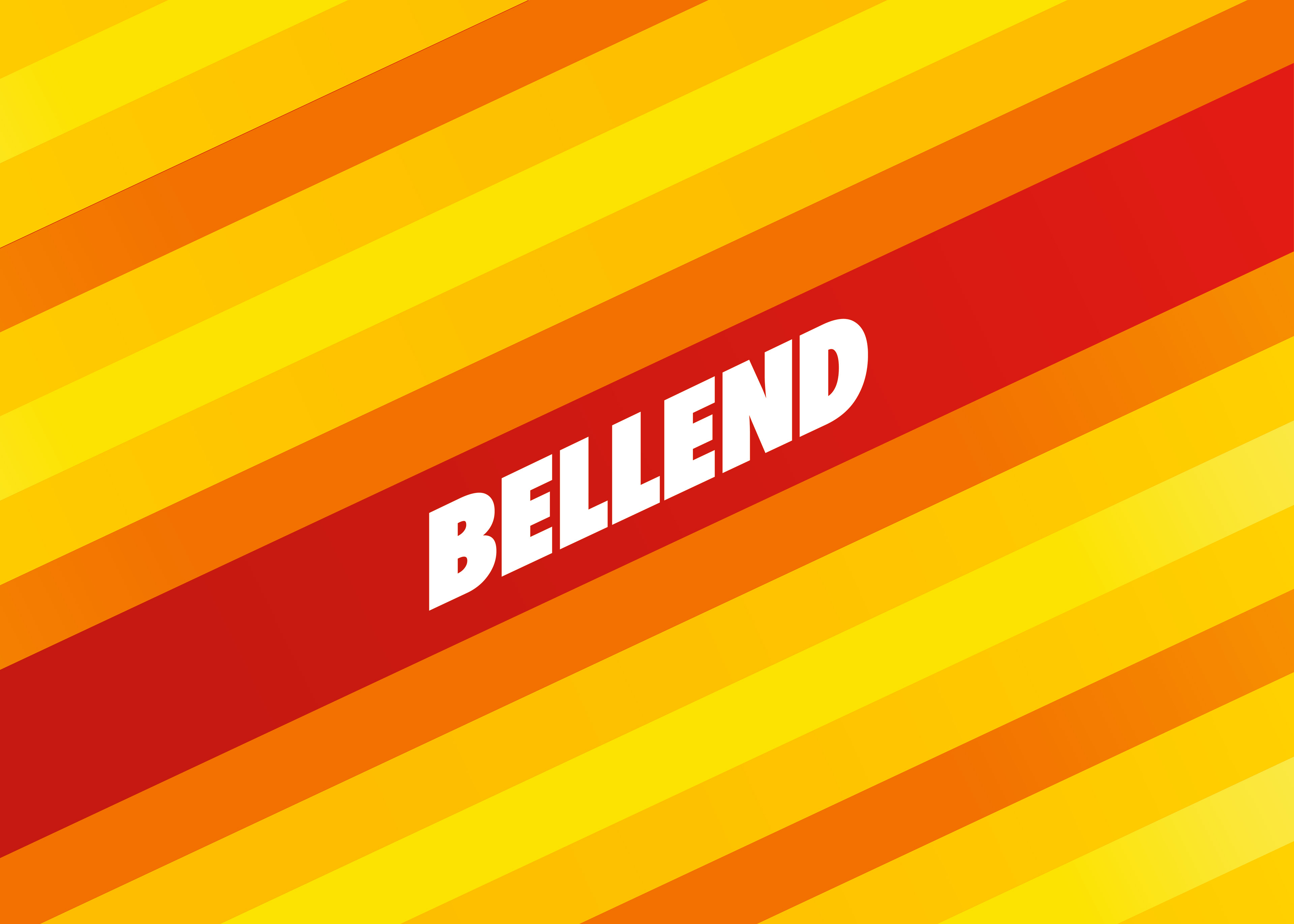
The product is aimed at young adults with the intention of being purchased as a gift or for light-hearted entertainment at a social gathering. With this in mind, I aimed to make the cards as varied and fun as possible through my choice of colour, typography and style.

How Does It Work?
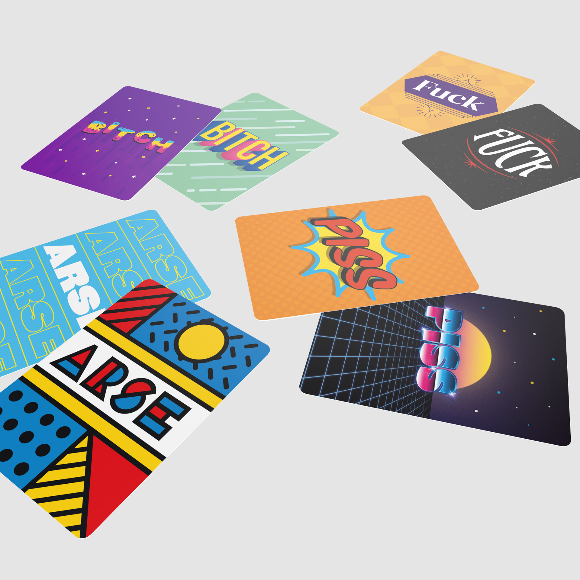
This is a twist on the classic "snap" card game, where players win by matching cards of the same suit. In this version players win by matching the words, encouraging them to read the cards and not be caught out by different words using the same visual style.
Project Development
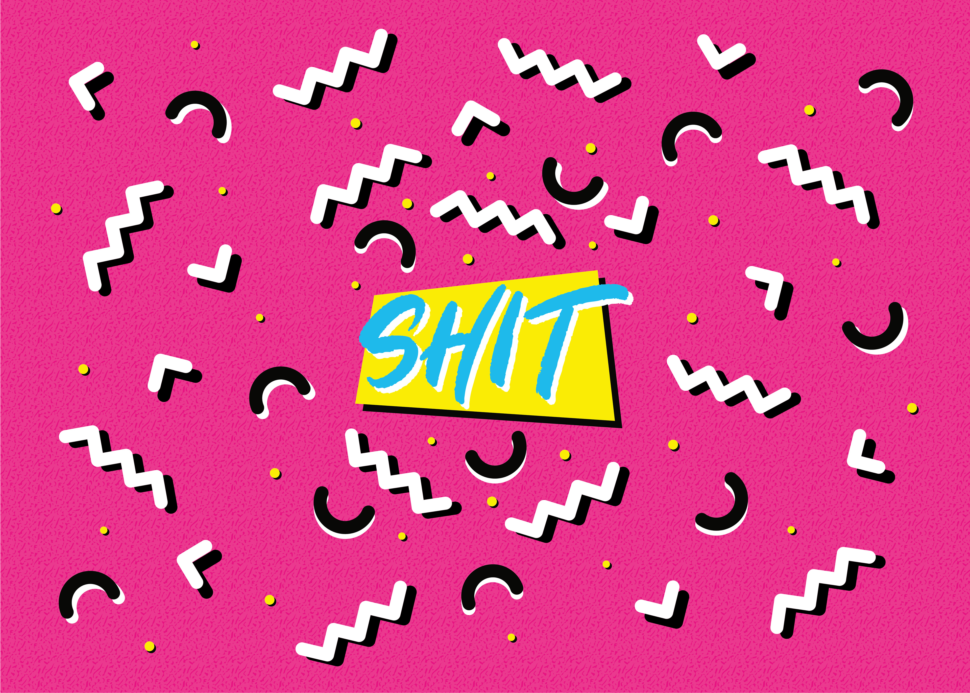
The client entrusted me to develop designs for each card, allowing me to research a range of different visual styles. Throughout the process I created designs which were distinct from one another in regards to their use of colour, typography and illustrations.
The outer packaging also went through different iterations during the design process, with a more vibrant approach being tested before settling on a more subdued and mature look to the box design.
The outer packaging also went through different iterations during the design process, with a more vibrant approach being tested before settling on a more subdued and mature look to the box design.
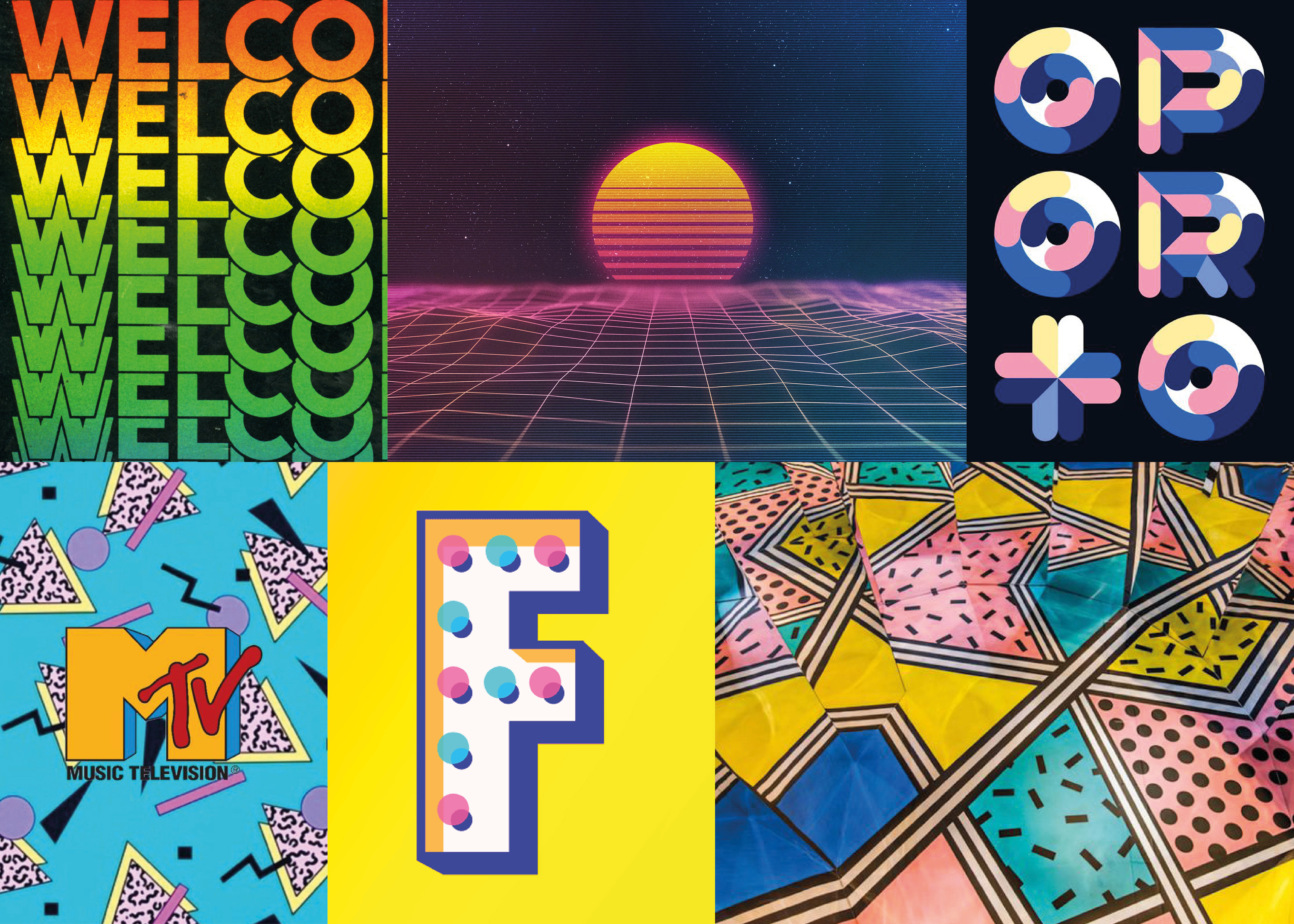
A moodboard illustrating some of the visual styles I explored while developing this project.
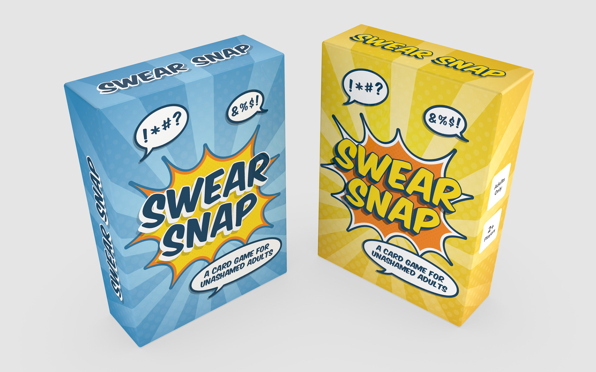
Concept artwork for the outer box designs showing a more bold and eye-catching approach.
The Project's Success
The game has proven successful in its retail release, with strong sales through outlets such as Amazon and WH Smith.

Project Credits
Creative Lead: Ric Gray
Client: Summersdale Publishers, Ltd.
Client: Summersdale Publishers, Ltd.
Thank you for reading!