
Project Brief
The client asked me to develop book jacket designs for a series focusing on pop culture throughout the 1980s, 1990s and 2000s. Working closely with the editorial team at Summersdale, my role spanned the entire creative process, from concepts to final approval. For the purposes of this project I will focus primarily on the concepts, with a look at some changes made for the final designs.
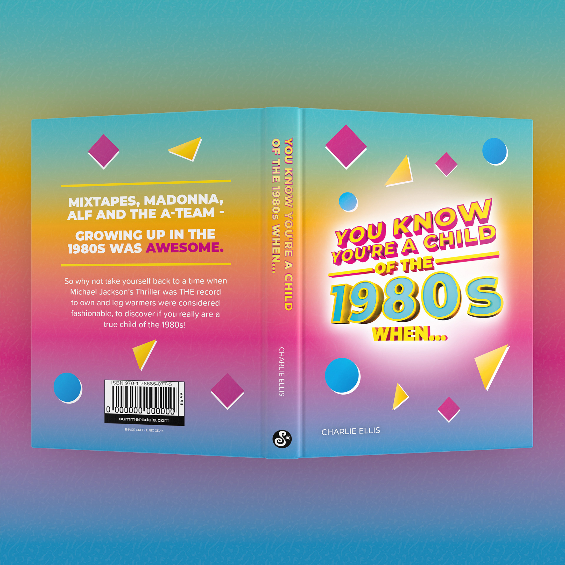
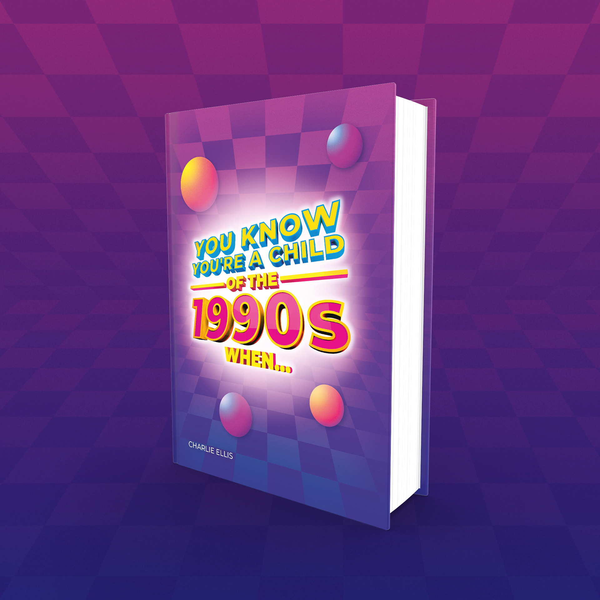
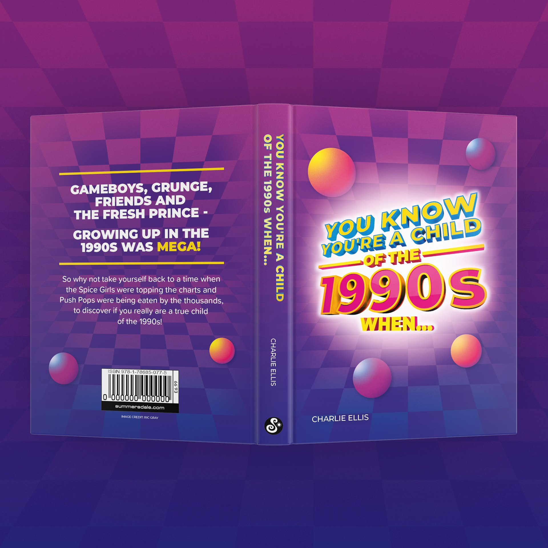
One of the requests from the client was to achieve a sense of consistency across all designs and this was achieved through the title's style remaining the same across each book, with some changes in colour.
Who Is It For?
These books are intended for people who can remember each decade in some detail, which casts a fairly large net of adults in their early 20s to late 30s. I decided to research the visual style of each decade when developing these designs to help transport a potential reader back to that time.

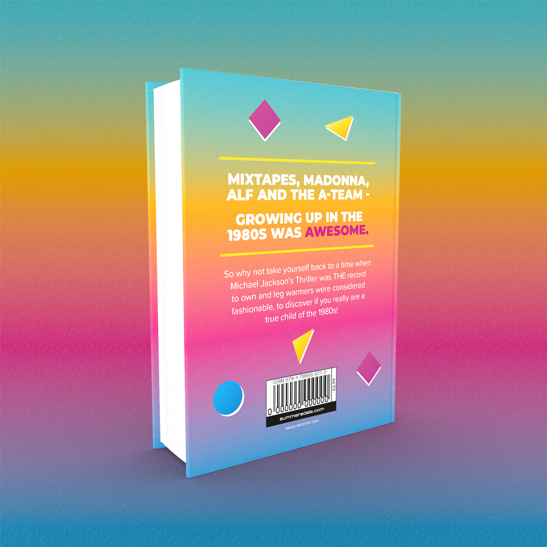
A back view of the concept jacket designs.
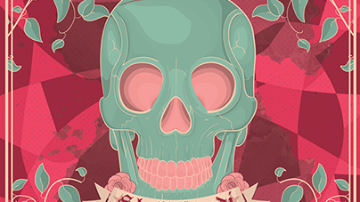
You Know You're A Child of the 1980s When...Concept Design
The 1980s was a very colourful period in many areas of pop culture with bright, neon colours being prevalent in everything from fashion to television. With this in mind I created a concept which complemented that, adopting a Memphis-style look across the jacket design through the incorporation of several different colourful shapes and subtle texture alongside a bold gradient to help this design stand out amongst the competition.

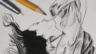
You Know You're A Child of the 1990s When...Concept Design
The 1990s saw a continuation of bright and colourful designs being a key part of pop culture, although the development of 3D graphics introduced a new range of possibilities in creating visuals with more depth. I looked to some surprising areas for inspiration such as the stylish blank VHS covers which were prevalent during this decade, and the dark and gritty look of 90s rave flyers.

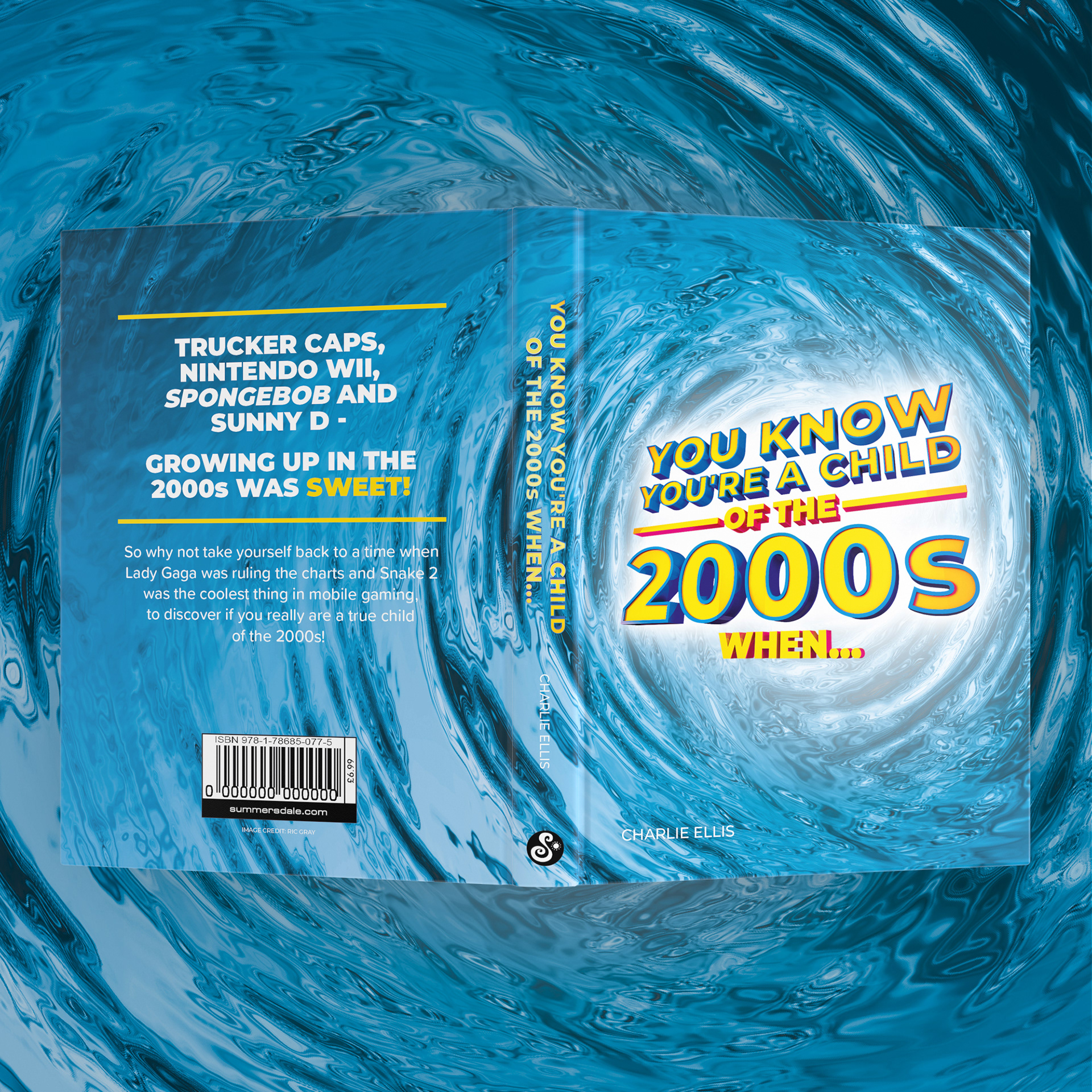
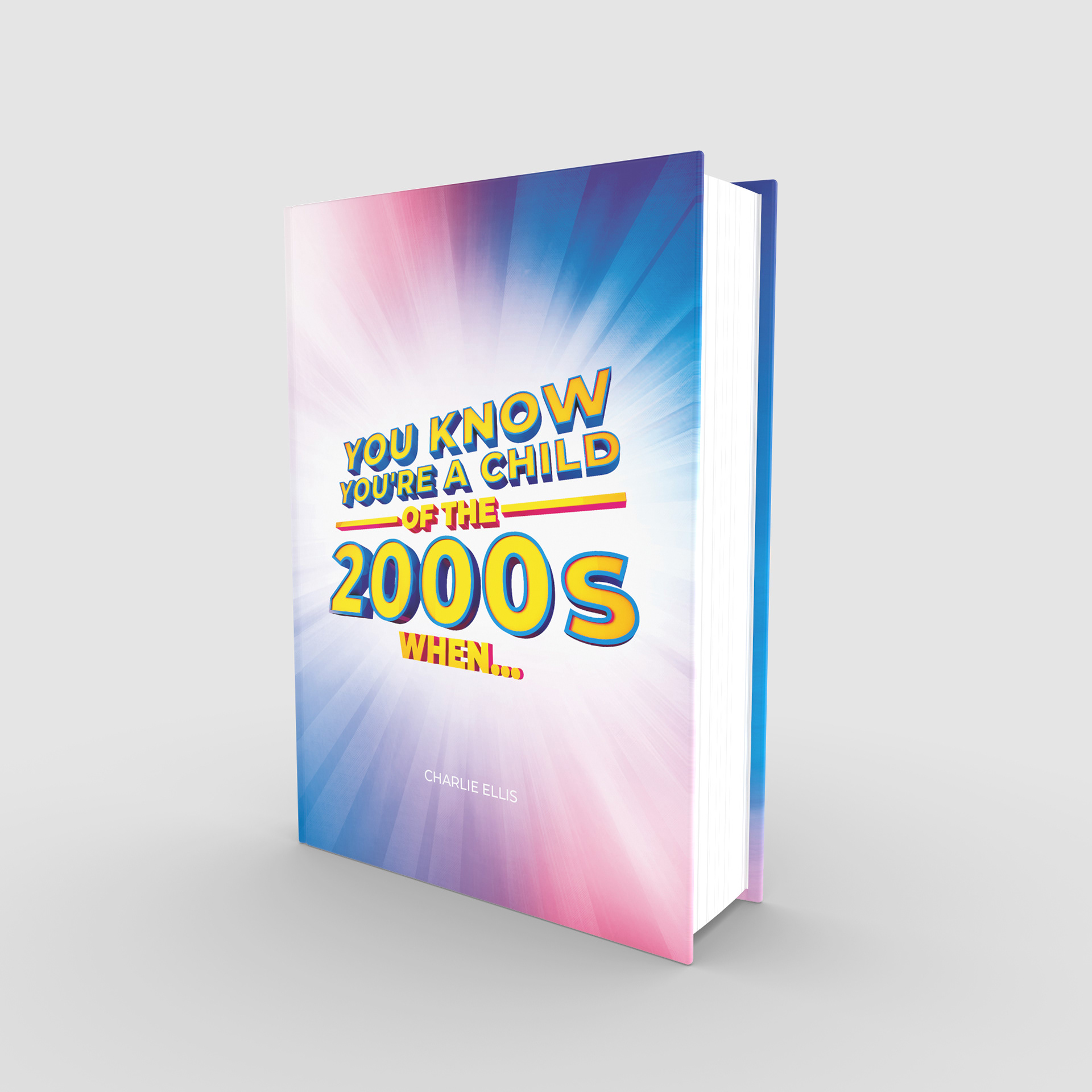
You Know You're A Child of the 2000s When...Concept Design
As we moved into the 2000s there was a sense of optimism for the future, with 3D imagery and a chrome / metallic look being prevalent in pop culture. With this in mind I developed a jacket which looked to reflect some of these visual themes.


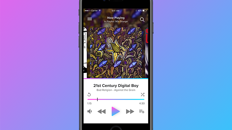
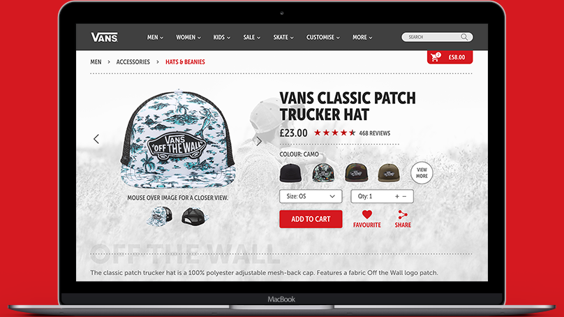
Promotional Material
To develop the project further I created concepts for promotion across digital and print formats, such as Instagram posts and full-page print ads. This allowed me to translate the designs into different formats and include key pieces of information across these pieces, such as the release date and their availability on different retail platforms.
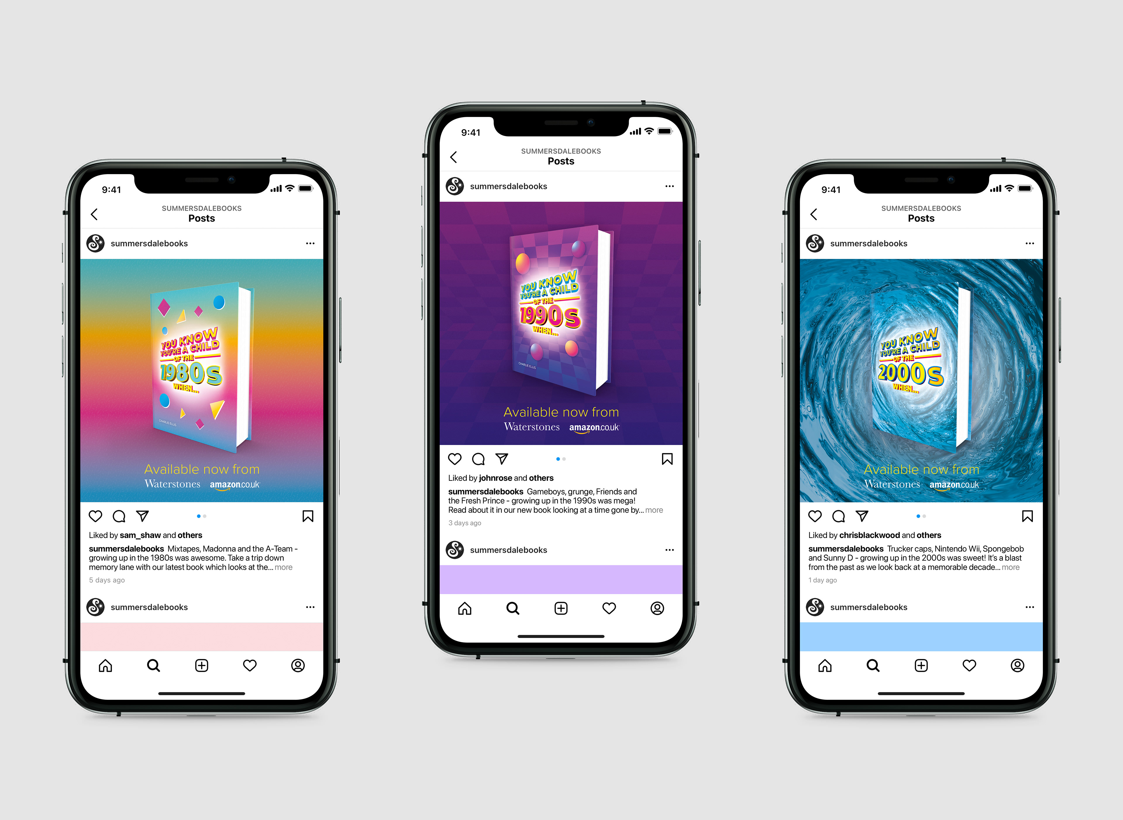
Instagram advertisement mock-up concepts.
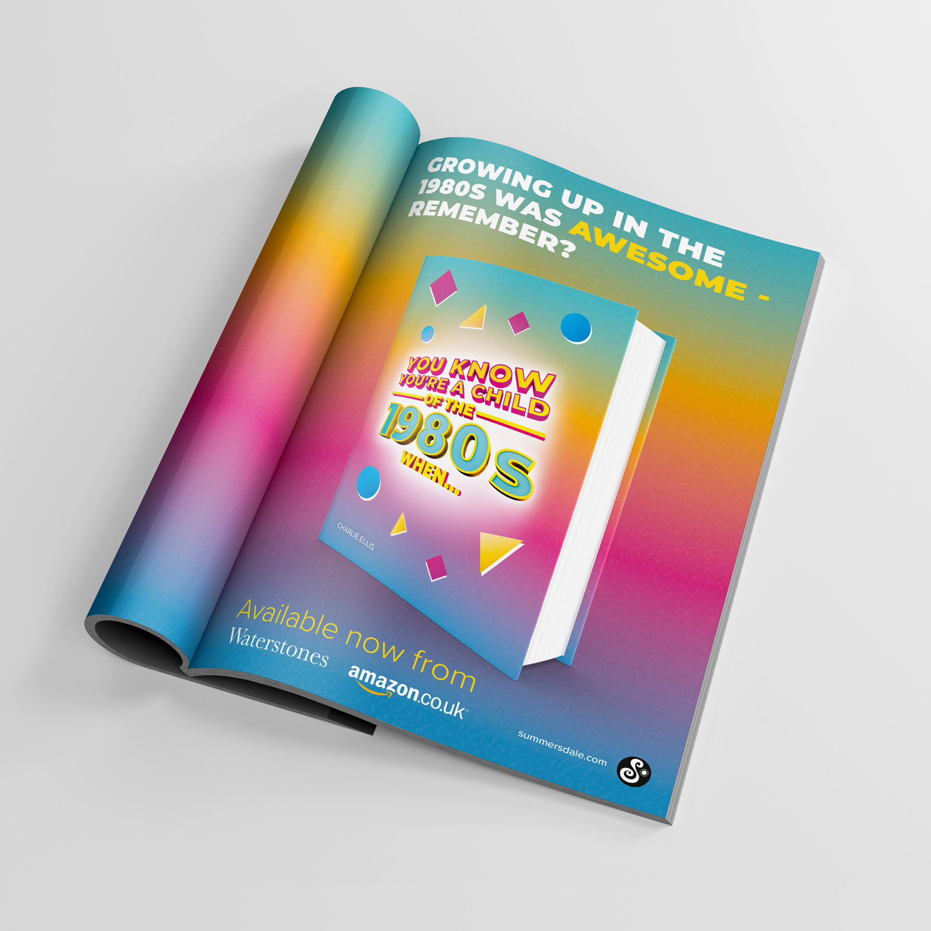


Print advertisement mock-up concepts.
Concepts Versus Final Designs
Following the creation of these concepts, the client requested some changes be made to each cover. While the changes to the 1980s cover were minor, the 1990s and 2000s covers changed more significantly. In these redesigns I aimed to retain the bold and vibrant nature of the covers, while incorporating a pink and blue colour scheme which created a consistency across both designs.
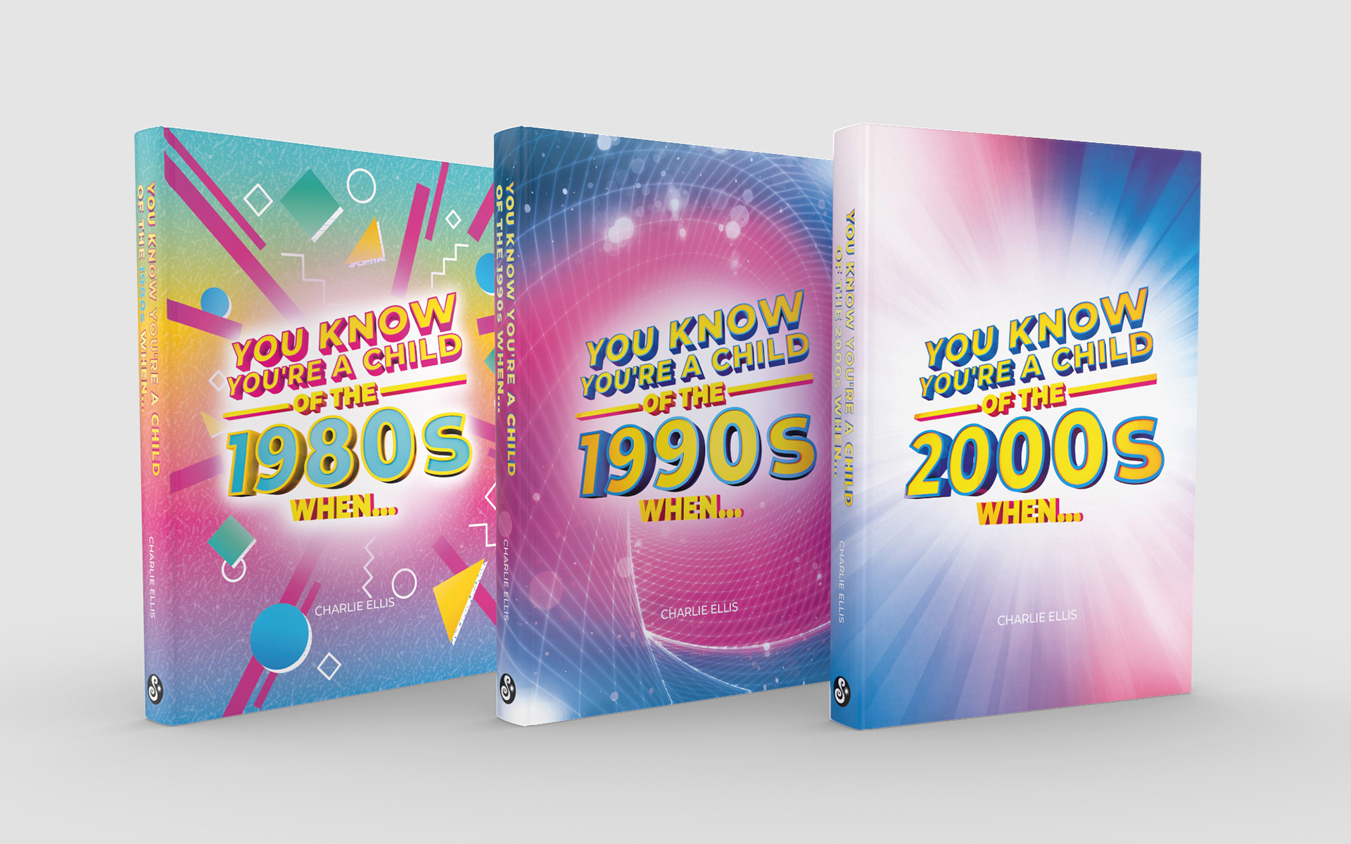


Final designs approved by the client.
Project Credits
Creative Lead: Ric Gray
Client: Summersdale Publishers, Ltd.
Client: Summersdale Publishers, Ltd.
Thank you for reading!